Objective
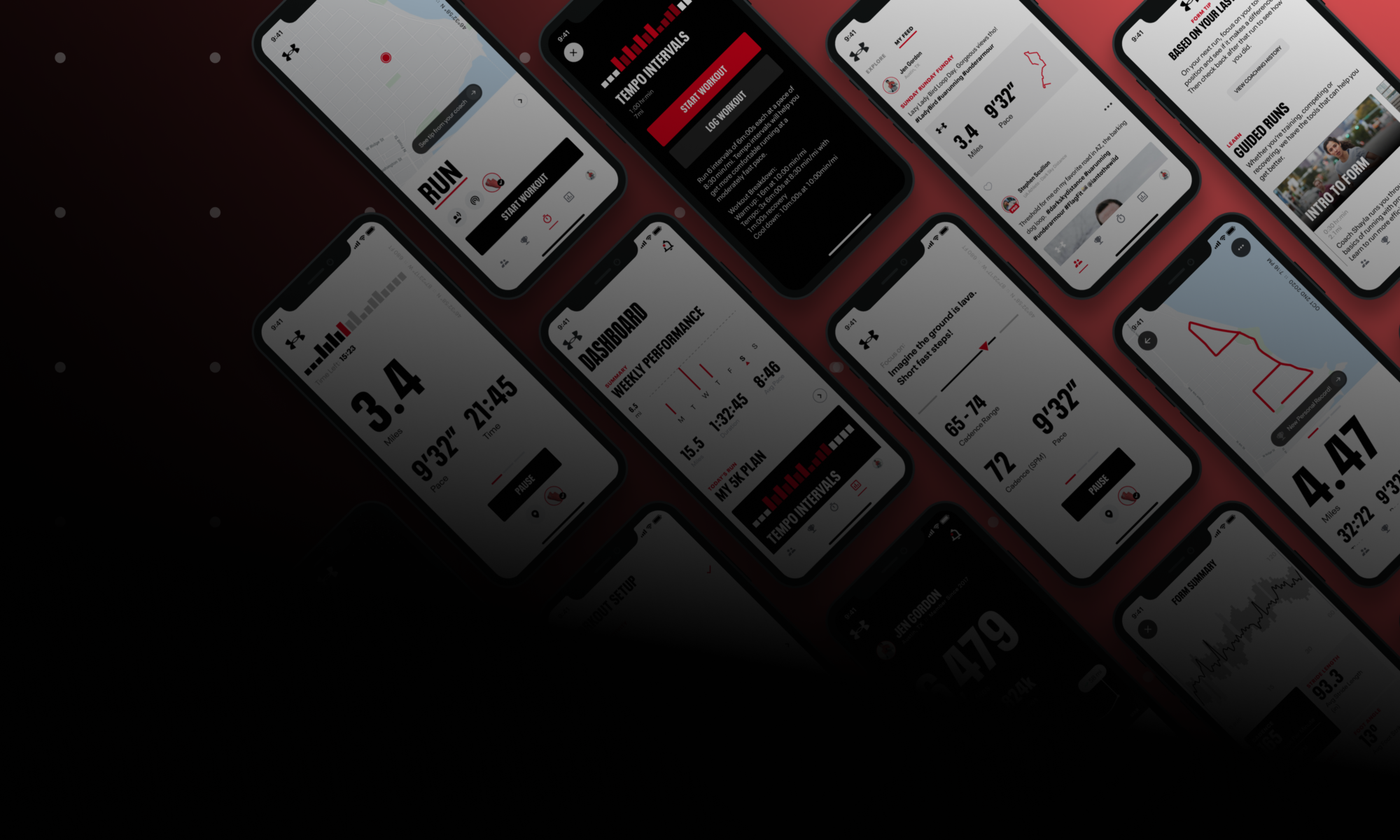
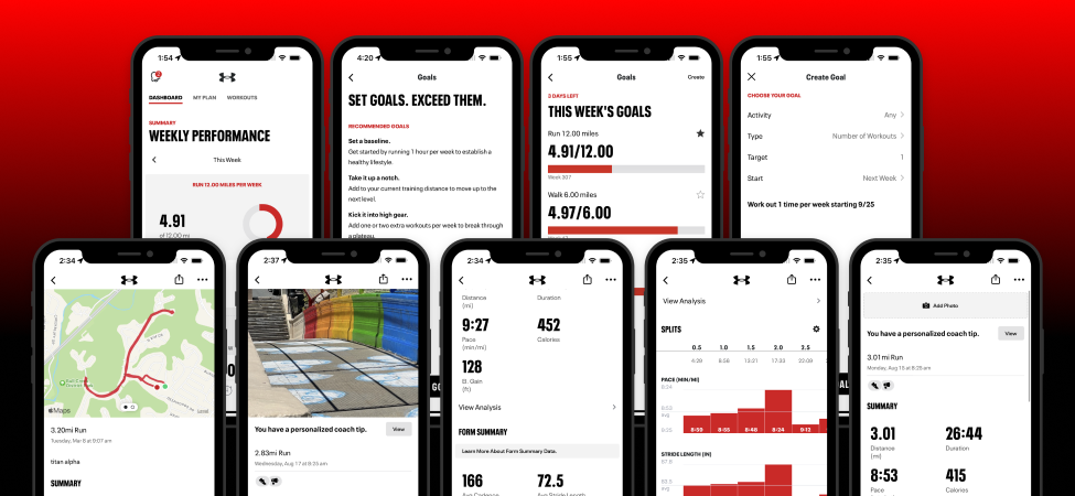
The top-level objective was to update MapMyRun styling to reflect the Under Armour brand. The need was to create consistency across all Under Armour properties to build trust, extend into UA story-telling, and act as a vital touchpoint of the Loyalty Program scheduled for its pilot program release.
Approach
Creating the Vision
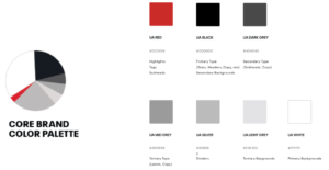
We were given explicit constraints from the CCO around the core brand elements. This mandate gave us the advantage of setting a universally agreed-upon baseline. With this foundation established, we conducted competitive audits and created mood boards for inspiration. We held design workshops to generate multiple concepts. We then took these concepts and focused them on unique themes.
Vision Alignment
After building out these themes across the key screens of the MapMy experience, we built alignment by socializing these ideas with all stakeholders. Stakeholders included cross-discipline groups, UA brand creative, and executive leadership.
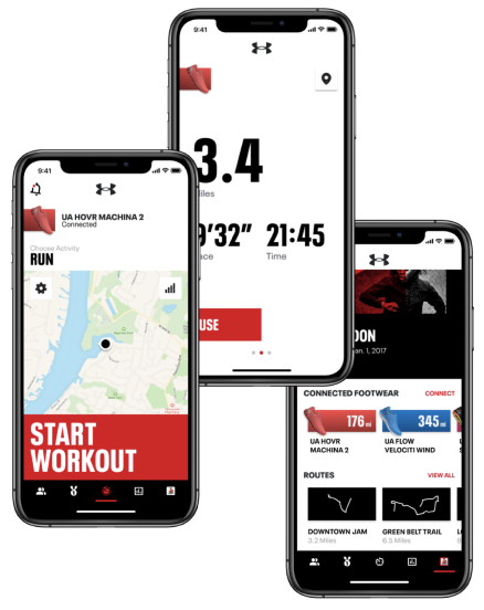 | 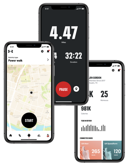 | 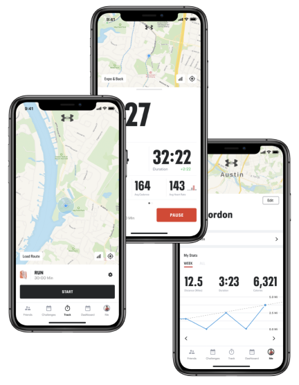 |
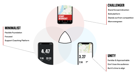
In this alignment process, we avoided combining elements from our themes and creating a “Frankenstein” design creation. Instead, we focused on the principles revealed by the feedback to act as a North Star for our Design Vision.
Measures of Success
First and foremost, the goal was Brand driven. Over the years since Under Armour’s acquisition of MapMyFitness, we had brought the branding closer to UA but still did not have high recognition that MapMy was Under Armour. This effort would close the remaining gaps to present as a family with UA properties and provide a platform for loyalty and other marketing initiatives.
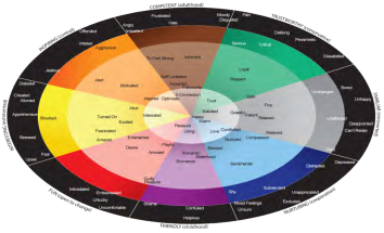
We measured the brand affinity of our concepts with help from a testing partner. We collaborated with this partner to design a test measuring emotional responses relative to the previously established UA Brand Right Index and provided them with testing stimuli. The positive test results we received gave us confidence in our chosen direction and alignment with the steering committee and executive stakeholders.
Design & Delivery
With a confident vision established, the next step was to create a plan to bring it to fruition. This step involved heavy collaboration across Design, Product, PMO, and Engineering. We needed to check against what was possible to build in the available time frame.
Also, with an active user base in the millions, we needed to ensure we did not harm the experience. To keep releases small and prevent overly complex code branches, we decided on a release strategy that led with low-impact screens and allowed us to build out components of our Design System. This strategy also acted as a low-stakes way to test the acceptance of our designs before investing time in the more complex and frequently used screens.
Working cross-functionally in sprints, we designed, collaborated, iterated, built, and tested each section of screens and progressively delivered the updated experiences. We used rollouts to perform A/B testing throughout to prevent any adverse results of our new designs.
Outcome
Overall, the results were very successful. We hit our goals of updating the portions of the experience targeted as necessary to support the Loyalty Program and supplied the updates in time for the Program Pilot. The updates were delivered as components of our Baselayer Design System, allowing for faster future delivery and updates.
We did receive some negative feedback from customers displeased with the color updates. That feedback was unsurprising as an expected outcome of any change to a popular experience, but also limited in quantity and trended toward subjective preference versus any loss in functionality.
Finally, there were some unexpected benefits that we were able to measure. Several KPIs improved as a result of the updates. As an example on Android, where applying consistent components brought some interface components into more updated patterns, we saw
- Engagement with workout status increased by 19.5%
- Workout Sharing increased by 27.5%
- Workout Likes increased by 30%
