Objective
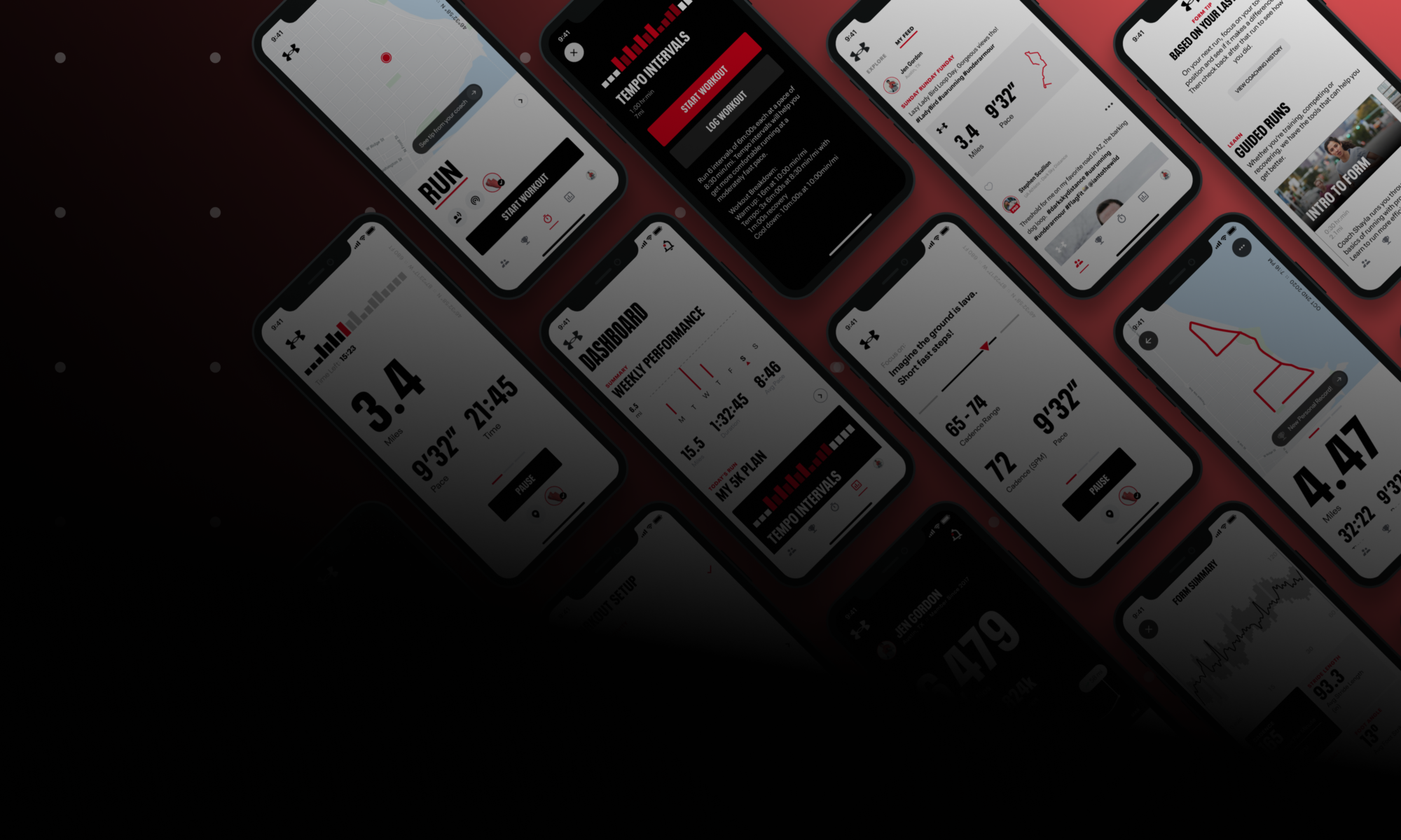
In conjunction with the Visual Refresh work, there was a strong desire to modernize and streamline the MapMyRun platform: not a “lipstick on a pig” project but a comprehensive overhaul. If we were going to spend the effort to update the App visually, we also wanted to get the benefits of establishing a code-backed design system.
There are many reasons for implementing a Design System. Doing so would allow us to design and build faster, be more consistent within the App, and maintain that consistency across all platforms. But those outcomes do not come for free. It takes substantial effort and resources to achieve those benefits and discipline to stay on the path.
Approach
The first step was to get uniform commitments across the organization that this was an approach we were willing to pursue and maintain. Collaborating closely with Engineering and Product, we aligned on the desirability of using a Design System. Aligning with these stakeholders was the easy part. The key to making the Design System real was demonstrating how it fitted into the overall product strategic goals and making it a formal initiative on the official roadmap with measurable KPIs.
The approach forced some practical considerations. We established a team of focused contributors and responsible parties. We also set up a regular cadence of cross-functional work sessions, accountability check-ins, and informational presentations. Finally, it forced us to focus on achievable targets to demonstrate measurable progress.
Establishing patterns
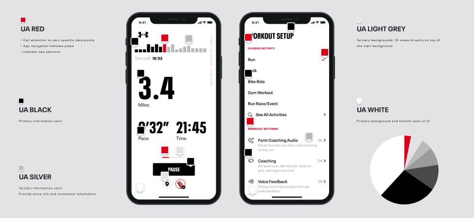
As an outcome of the Refresh work, we were able to leverage our updated vision across an audit of the App and Web and bring consistency to our design elements across the entire system. We used a few key screens to establish the system’s base and then divided the remaining screens across the rest of the design team to apply the established rules. We reduced over 200 instances in color down to less than 20 values. We achieved similar consolidation with the typography.
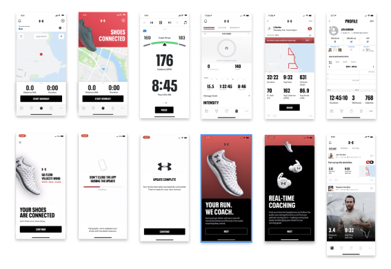
We focused on hitting a transition toward the ultimate visual refresh, allowing ourselves to aim for progress over perfection. This approach prevented us from getting mired in decision paralysis. It kept us focused on the vital benefit of a systematic approach, allowing us to learn and make global improvements in the future.
Making Components
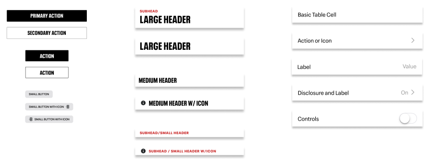
Working from an inventory of representative screens across the experience, we identified the tier-one components that would have the most significant impact, such as inconsistent elements used broadly across the App. We identified the best opportunity in components such as Buttons, Typography, and table cells.
Global UI
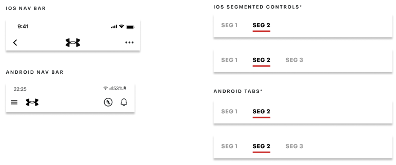
In addition to foundational components, we identified specific global elements with noticeable MapMy-specific branding. These changes helped us balance applying the new components across our phased delivery approach.
Delivery
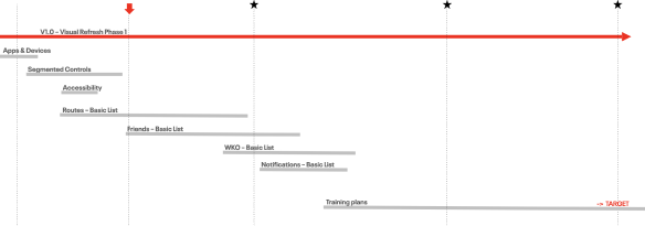
Working collaboratively with our cross-functional team of Product, Engineering, PMO, and Design, we established a delivery plan to break up our components and deliver them to allow us to maintain a positive experience for existing users and monitor and measure any potential negative impacts. Design worked ahead, applying the components to the designs while remaining responsive to any dependencies we learned. The cross-functional work sessions were valuable during this process, and we resolved obstacles quickly.
Outcome
The sequencing went as planned, although there were adjustments to timing as we gained experience with the process.
Settings/List screens

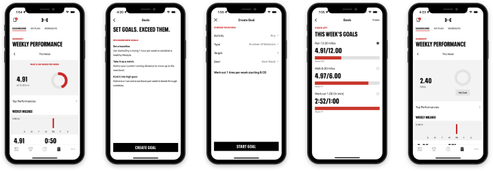
Goals & Dashboard
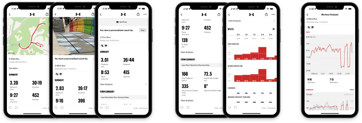
Workout Details
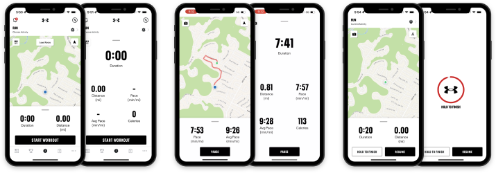
Pre-record & Record
Impact
The impact was that we cleaned up code and brought much-needed consistency to our experience while aligning the branding needed to support a key initiative of supporting the Rewards program. There was some learning curve in building some of the components efficiently, but we saw dramatic increases in building speed once we established their usage. Engineering delivered Table cell-based screens in half the estimated time toward the end of our work.
